Before
As background, when we purchased the house, our backyard lacked versatility and was aesthetically barren. In short, it was not a place to linger. There was a large, awkward and ugly maroon concrete back stoop that took up a lot of space and served little purpose. The compressor for our air conditioner took up valuable square footage while making the space uninviting, loud and uncomfortable. There was no deck on the side of the house, thus rendering the space (and the exterior side doors otherwise connecting to the same) useless. The yard itself was covered in tan-colored pea gravel and contained no greenery. The exterior sconces were too small in scale for the house. Finally, the color palette of the paint scheme was dreary.
The backyard was not completely useless, of course. It provided us with off-street parking, a valuable asset in the city. It also provided the perfect area in which to let our dog out.

The Design
We wanted to create a multi-functional attractive space that was an extension of our indoor living area. We wanted to have an area for outdoor dining, for lounging, for cooking, and for gardening. At the same, we wanted to maintain the ability to park in the backyard and to have an enclosed outdoor are for our dog. Aesthetically, we wanted a modern, monochromatic, lounge-like look.
Construction-wise, the plan we conceived was to build a new, more linear stoop and two connecting planters (one running on the back wall of our house and one along the side wall of the neighboring house) in the rear yard. The stoop and planters would be capped with blue stone and faced with stucco to match the material of walls of the back of the house. The planters would be of a height and depth to function as additional seating. Along the side of the house, we planned a wooden deck.
In addition to the construction elements, we planned to replace the backdoor with a single-panel French door, which would allow light into the back of the house and create a better sense of flow between the indoors and outdoors. We decided to move the air conditioning compressor to the roof to free up some space and to make the backyard more pleasant to the senses. We decided to replace the construction grade, tiny sconces with more substantial, modern looking ones. We decided to add landscape uplights for some night time drama. We also decided to replace the pea gravel with a different stone -- small gray/white marble -- to better compliment our color scheme (the pea gravel had proven to be practical, low-maintenance and eco-friendly, but they weren’t thrilled with its color). Finally, we planned a new paint scheme to compliment the new blue stone.
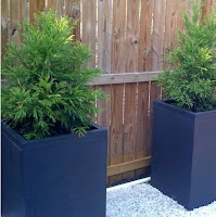
To accessorize the space, we decided to acquire three large planters to place against the side wood fence. We sought to acquire dining and lounge furniture that echoed the grays, blacks and wood of the overall design without looking too matchy matchy. We also planned to incorporate climbing hydrangea, several evergreen shrubs and trees, flowering bulbs, and annuals in the backyard.
 The Result
We hired a contractor to do a lot of the skilled work (e.g., building the planters, stoop and deck), but put in a fair amount of sweat equity in executing the project (e.g., painting, re-grading the yard, planting everything, etc.). Adding everything up -- from the construction costs to the furnishings -- we spent about $10,000 on the backyard. We've already really enjoyed using it and think we'll have a lot of fun using it for years to come, so we call it money well spent. Below are some photos of the final product.


15 comments:
it looks amazing guys. great job, very cozy, but also chic.
thanks, anon!
wow, it looks fantastic! great job!
Pretty
W-O-W!! Amazing landscaping work. Congrats
thanks, all!
I might go into some detail in subsequent posts about some of our DIY and specific projects/finds/buys.
where did you guys find your new back door? I've been looking to replace mine and would like one similar in style to the one you've purchased. Thanks!
Jason - the contractor who built our stoop and planter purchased the door for us -- I'm not sure what supplier he used; I believe it's a Stanley door. Material and labor for the door was surprisingly expensive -- about $1,200, I think? That entailed a new door frame, etc.
$1200 actually sounds like a really good deal considering the frame and installation was included (believe it or not). If you don't mind me asking, who did you use as your contractor. Maybe I can get a quote from him ... or at least find out where he's ordering from! :D Thanks for getting back to me so quickly!
Jason -- email me at slumhistorique at yahoo dot com. I'll look up our guy's tel. number and pass it on to you.
So pretty and so inviting! The before and after is really, really impressive.
Yeah, great job - it looks fantastic from the pics.
Absolutely gorgeous, such a lovely urban oasis! I love all of the planters.
I put similar doors in our basement apt, had to get all the light possible down there:) I special ordered em at lowes, they were metal. your door really looks nice.
looks great - question: who built your fence?
Email me and I can provide a recommendation, herrarmstark.
Post a Comment